Back in 2017, I was part of the Open Toronto meetup, and got to mingle with some highly knowledgable data analysis and scientists alongside government officials and civic-minded Torontonians, while making a few of my own analyses and visualizations of city data. I’ve created a small showcase of visualizations here (partly to see if I can embed plotly HTML figures).
If you’d like to know the context for each of these figures, please have a look at my Open Toronto page, or click on one of the links below.
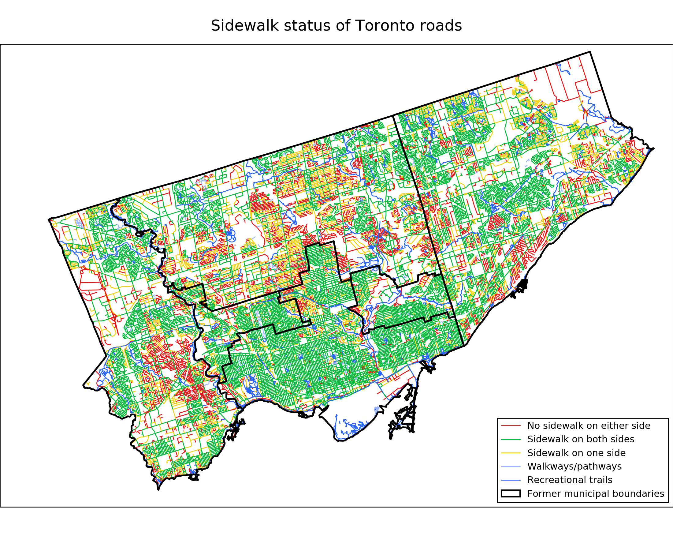
Toronto City Sidewalk Inventory
The Toronto Sidewalk Inventory is a geospatial dataset that gives the availability of sidewalks along Toronto’s transportation corridors. I plot a map of these sidewalks, and investigate the correlation between lack of sidewalks along the roads of a neighbourhood with its population density and median household income. I find that the fraction of underdeveloped or missing sidewalk tends to depend on population density and on zoning, with densely populated areas and residential and commercial zones having very little missing sidewalk. Missing sidewalk, however, is not correlated with neighbourhood income, so there doesn’t appear to be any favouritism from city hall toward richer neighbourhoods.
MyDem0cracy
The MyDem0cracy Canadian electoral reform survey (note the replacement of “o” by “0”) was produced by a group of concerned citizens as a complementary survey to the controversial MyDemocracy.ca survey by the Government of Canada. The survey solicits freeform comments from participants, which are then posted to let subsequent participants vote (“agree”, “disagree” or “neutral”) on the comments. I investigate the consensus opinion arising from these comments, and attempt to determine clusters of voters with similar opinions. In the aggregate, I find that particiapnts are all highly in favour of greater political education and civic engagement. They disagree, however, with how electoral reform should proceed, with one large group of users advocating for proportional representation, another in favour of the current system, and a third without a strong opinion either way.
Ontario Trillium Fund
The Ontario Trillium Foundation (OTF) is an agency of the Ontario government that annually allocates more than $136 million dollars in social/community program funding province-wide. In accordance with the Ontario government’s Open Data Directive, OTF provides data on successful grant applications over the last two decades on their open datapage. I perform an exploratory analysis on this data, examining how aggregate, per-capita and per-project funding is divided into different project areas and geographic regions, and how this changes with time. I find that:
- The total amount of OTF annual funding per capita has gone down by about 20% over the last two decades.
- The total number of grants has gone down by a factor of 2 since 2011, most pronounced in the number of arts and sports & recreation grants. The amount per grant has gone up by about 50%.
- While geographic regions with larger populations typically get more money in total, they get around 30% less money per capita. This is likely because urban areas are wealthier and already have established resources and institutions, and so need funding less.
Share this page:
Twitter Facebook LinkedIn